Marc B.D. Greenberg
 
Frankly messenger app preview


Redesigned messaging from the ground up

 
Marc is the most wonderful kind of Swiss Army Knife: versatile across all aspects of product and design, but extremely sharp where it counts  ...  He took things to a level we didn’t even realize was possible.
— Jon Nathanson, VP Biz Dev, Frankly


A new kind of messenger

Typical messengers just don't allow enough nuance and tone, meaning gets lost. Frankly took texting to the next level by adding the power to communicate with more than just words, pictures and simple emoji.

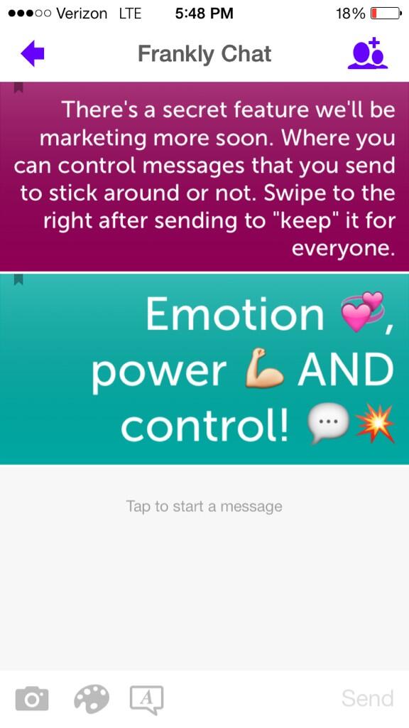
Frankly takes advantage of the full screen width, color depth, and rich typography that modern phones support to provide an immersive, more emotional and rich messenger.

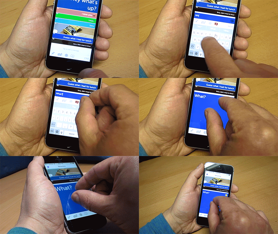
Simple gestures were added to allow more control and nuance through color and text size.


Texting on typical platforms vs. Frankly


My role

  • Product strategy & team management

  • IA, wireframes and interaction design

  • Visual design and brand management

  • User testing


Acting as both Product and UX director I managed our product roadmap, task boards and ran daily standups for the whole team.

I was a participating member and manager of our design team of 3, across all wireframing, interaction design, mockups, design specs and asset creation.

I also oversaw and executed all our user research and testing efforts.


From 100k users to over 2 million in under a year – let me walk you through the details...

frankly-quote-bg.png
 

Reinventing the product

The premise: Texting and MMS interfaces have remained relatively the same since the days of IRC.  Message on the left, then one on the right, stacked. Some are in bubbles; text is small. Nuance, tone and emotion are lost in text, and we can do better than just adding emoji.

My solution: Take advantage of screen size, resolution, typography, color depth and gestural interfaces of our mobile devices today. We can add tone, voice and intent to messaging and make the experience fun, engaging and more immersive!


Early wireframe sketch and thoughts on the new messaging concept

Early wireframe sketch and thoughts on the new messaging concept


Words with volume and tone, and 2 interface patents

After sketching up the new concepts, I worked with developers to create prototypes that built consensus and excitement throughout the company. 

Results:  two design interface patents were submitted.  Direct Manipulation of Text Size While Typing and Color Change Over a Field With Directional Preview Reticle.

 
Size change in action

Size change in action


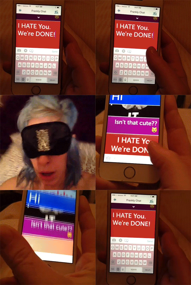
Some details from the unique interface interactions

Some details from the unique interface interactions


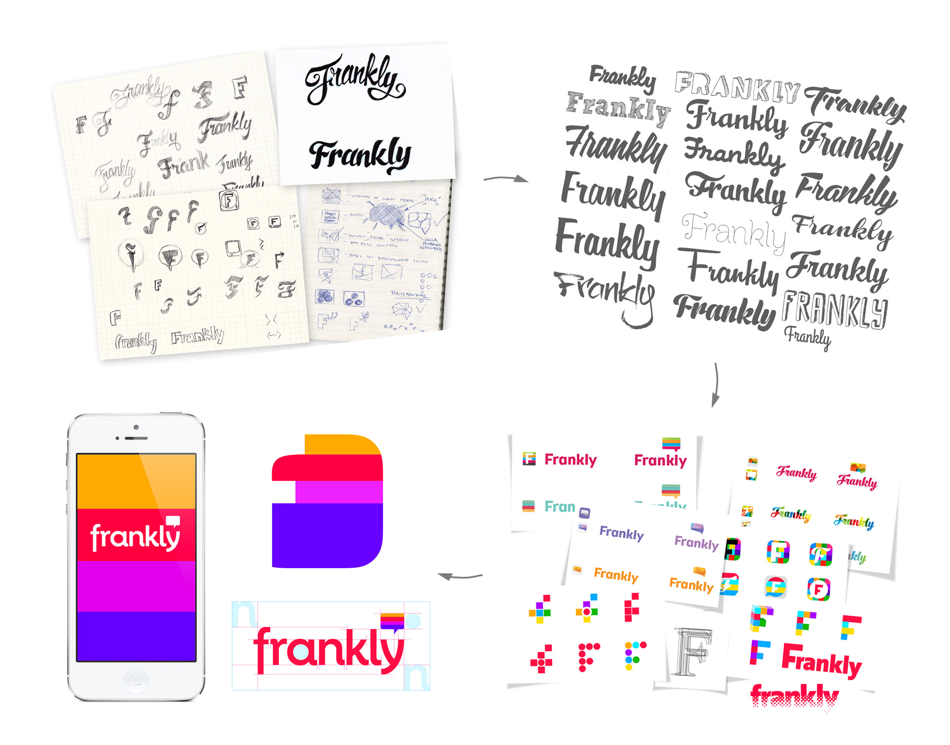
A new brand for a new messenger

Frankly needed a rebrand to push the story further and connect with the right audience.

I hired and managed an outside firm to assist with the work. Together we transformed the product from an office messenger to a young, fun, bold brand

Some pages from the rebrand work with Flissinger & Assoc.

Some pages from the rebrand work with Flissinger & Assoc.


Applying the brand to the product, went deeper than just a new color palette, fonts, and a logo. We applied the same liveliness and fun of the brand to the layouts and interactions.


The profile page before and after the rebrand

The profile page before and after the rebrand


And of course we had to make T-shirts!

 
Frankly shirts: logo and map versions
Frankly shirts: glasses and cool cat versions


Native Android and iOS interfaces

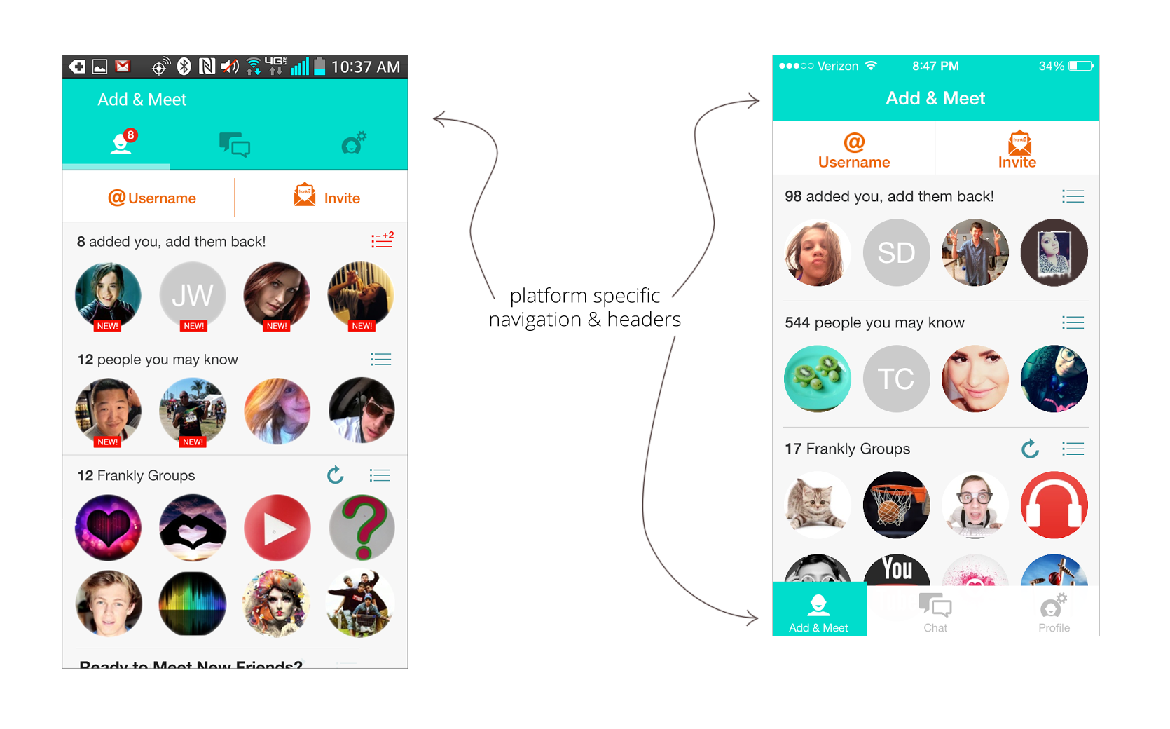
To keep Android and iOS releases in lock-step, our design process included designing interfaces that feel right on each platform.  The controls, navigation and headers were customized for Android and iOS in tandem.  Here’s a sample page in the new design across both platforms.


Customized designs for Android and iOS

Customized designs for Android and iOS


Testing, measuring, and improving

Guerilla usability testing in the mall

Guerilla usability testing in the mall

We created metrics dashboards and watched usage and engagement like a hawk with each release and feature change. We also performed A/B tests in the live product, and got out of the building for guerilla usability sessions with users on the street and in the mall.

In one multi-week A/B test we achieved a 20% increase in total multimedia sent per active user (a leading indicator of engagement and lifetime value), by testing the following 4 designs.


The details matter

A/B test results for menu options
 

The winning design had a simple 3 button view with fewer options up front and a multimedia drawer with more options and details when opened.
 

Winning option for the menu buttons
 

And the user creativity poured in...

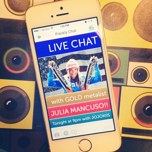
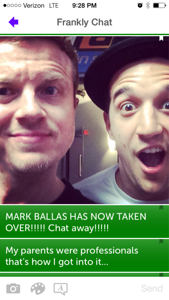
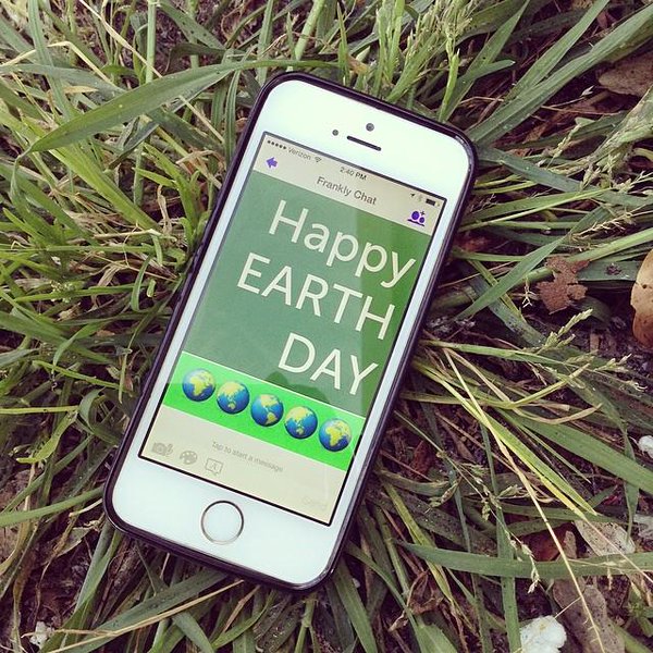
People created and shared their own take on having rich, beautiful conversations in Frankly.


Beyond novelty

Beyond the fun and novel personalization of messages, Frankly has the potential to take advantage of its unique interface to add another level of utility that other messengers don’t have.

Here are some of the experimental explorations.


Time-scaled search based on scroll speed

Time and size scaled search when scrolling fast. Utilizes size and color for rapid recall while scanning.

Automatic media saving and sharing options

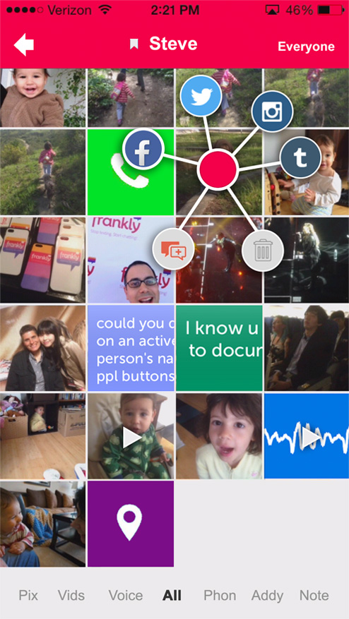
Automatic saving of addresses, phone numbers, and manual addition of saved messages to a filterable media drawer. Long press to share.

Grouping and zooming of media

Pinchable interface to zoom and scale media granularity


In their words

I worked with Marc on the executive team.

Marc is one of the most creative as well as organized UX and product people. His genuine ideas are always fascinating. From hands-on designing to managing UI/UX people, he’s just great at the job.

Also, he’s very passionate about what he’s doing and down-to-earth. Basically, an excellent colleague.
— Jungsoo Park, COO, Frankly
 
Marc is the most wonderful kind of Swiss Army Knife: versatile across all aspects of product and design, but extremely sharp where it counts. At Frankly, Marc not only came in and overhauled our UX — he reinvented the fundamental look, flow, and feel of text messaging. He took things to a level we didn’t even realize was possible.

The best part? From sketches to mocks to countless drafts to shipped product, Marc was a leader -and- a doer.

That’s where his versatility really shines. He’s not the kind of person who drafts up some concepts and then hands them off to the developers to build. He builds along with them. He gets his hands dirty. He’s a tremendous asset to Frankly, and any software team in the world would be lucky to have him.
— Jon Nathanson, VP Biz Dev, Frankly
 

Additional projects

Social gifting people love

Social gifting people love

Multigame mobile platform

Multigame mobile platform

additional-bg.png